
Testing practice: For Check accessible names, define a reproducible starting state, perform one controlled change at a time and record the result. Good testing evidence helps another person repeat the same path without guessing what happened.
Evidence quality: A useful report separates observation from theory. Record version, device context, steps, expected result and actual result while removing passwords, authentication codes and unrelated personal information from evidence.
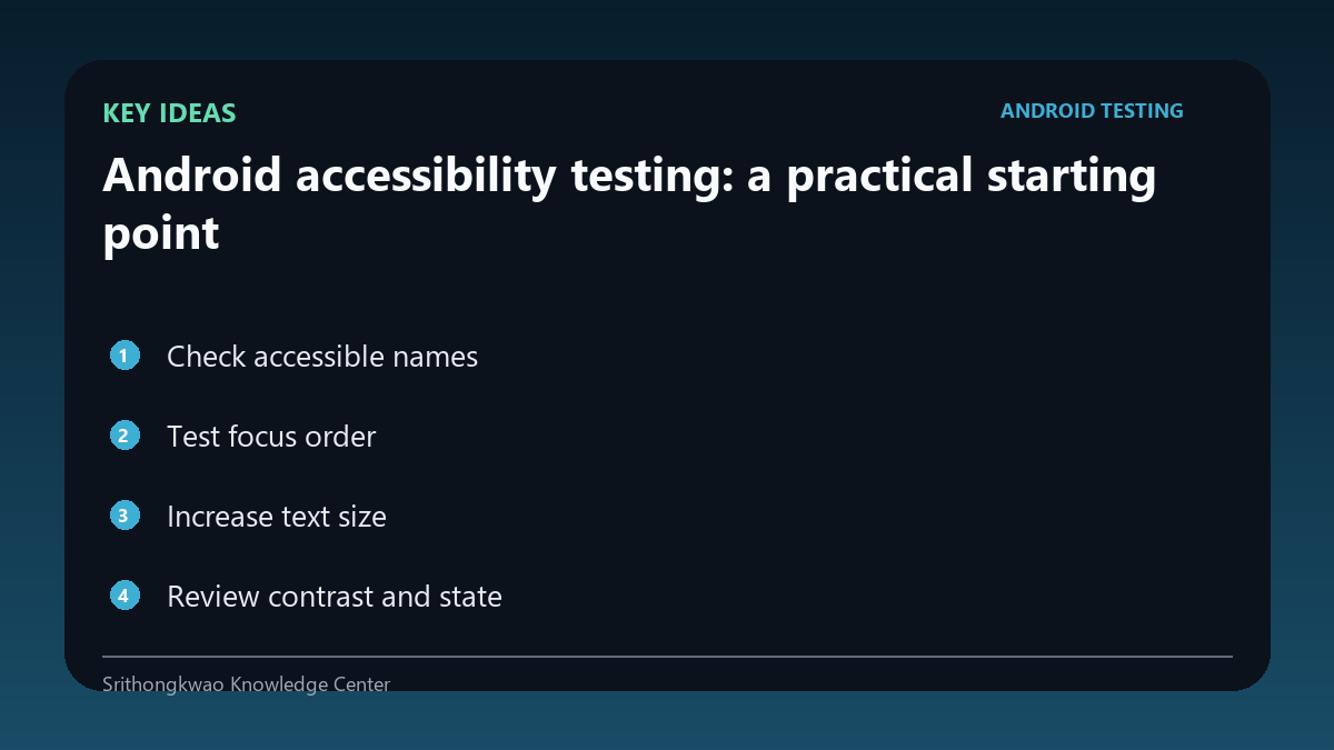
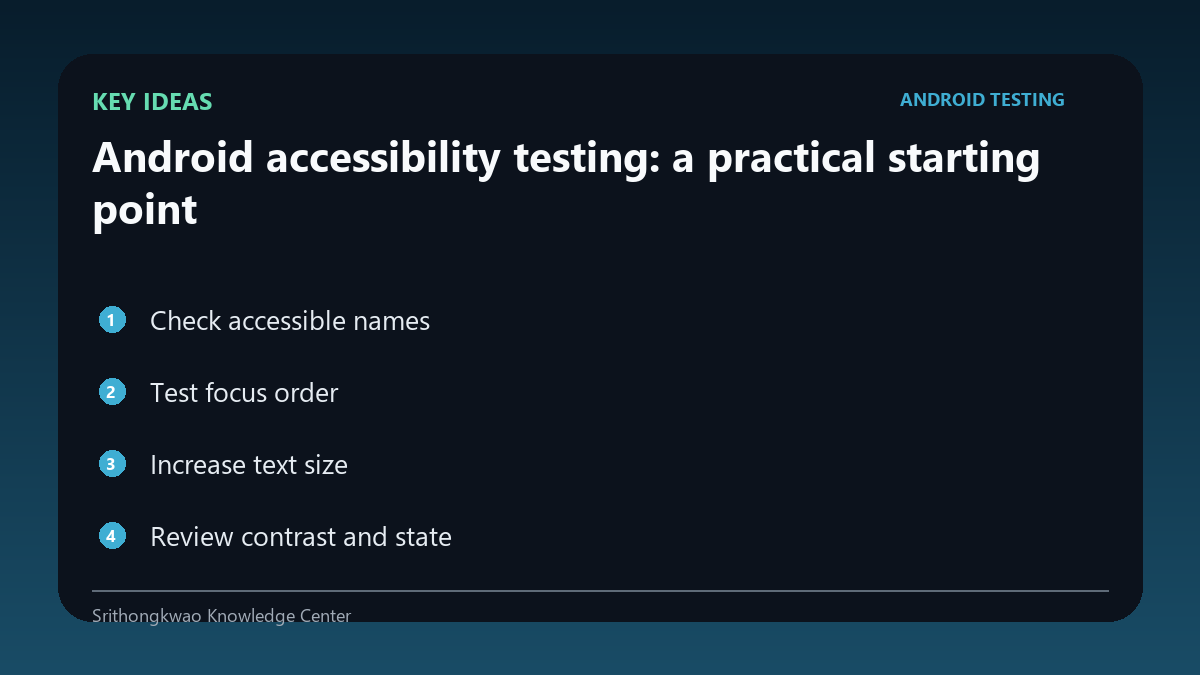
Check accessible names
Buttons and images that carry meaning should have useful labels for assistive technology.
Avoid names such as button1 or decorative image descriptions that add noise.
Test focus order
Keyboard and screen-reader focus should move through controls in a logical sequence.
A visually attractive layout can still be confusing if focus jumps unpredictably.
Increase text size
System font scaling can reveal clipped text and fixed-height containers.
Important content and actions should remain reachable.
Review contrast and state
Selected, disabled and error states should not rely only on subtle colour differences.
Use multiple visual cues where practical.
Check touch targets
Small controls are difficult for many users to activate reliably.
Test common device sizes and spacing, not only a large development phone.
Common mistakes to avoid
- Using icon-only buttons without labels.
- Testing only default font size.
- Communicating error state by colour alone.
Practical checklist
- Check labels.
- Test focus order.
- Increase font size.
- Review contrast.
- Check touch targets.
Frequently asked questions
Is accessibility only for screen readers?
No. Text scaling, contrast, motor interaction and other needs also matter.
Why test focus order?
Assistive and keyboard navigation depends on a logical sequence.
Can large text expose bugs?
Yes. Fixed layouts can clip or hide important controls.